Tuesday, March 29, 2011

Color Theory: 2011 and why honeysuckle doesn't suck


I may be a little late to the game in regards to Pantone's color of the year, Honeysuckle. But many of my friends and associates have been disparaging the new hue as too "girlie", preppy or limiting. This of course challenged me to find ways in which this pungent pink could become more palatable.  I have assembled a grid of fabrics that are great examples of reasons not to 'hate on' Honeysuckle!  As you can see they offer complimentary colors that help tone down the pink.  From the suit inspired houndstooth 'Sandpiper' to the batik ethic print 'Innovate'  to the sedate stripe of 'Wexford' there is something for everyone to love!
Pairing Honeysuckle with gold and brown brings it down to earth a bit... alongside a melange of antique wood tones and worn brass, it becomes bohemian chic.  
Via Good taste good tasting
For a more contemporary look, using the honeysuckle next to taupe, beiges and warm grays can make a neutral room pop! 

These fabrics are sold to the trade only.  If you wish to purchase any of these fabrics email Me !


Friday, March 25, 2011

Trends: The end of fast food?


I seem to be book obsessed lately but I cant help but mention the newest 'Big thing' to chefs all over the country.... Especially after seeing him on the Colbert Report!  Nathan-Myhrvold on the Colbert Nation introduces his new 5 volume edition of Modernist cuisine.  Hailed as the "The most important book in the culinary arts since Escoffier" by Tim Zagat it may well be worth the $625 retail price.  Incredibly beautiful photographs by Ryan Matthew Smith that are both artful and informative we get a glimpse of how close art and science can be. The Father of Molecular Gastronomy, Ferran Adria says "This book will change the way we understand the kitchen". 
Nathan enlists the help of Chris Young and Maxime Bilet of The Fat Duck fame to produce an amazing compendium of Modernists Cuisine.  With only one volume focussing on recipes, they serve to primarily showcase the tools and techniques than to illuminate us on any particular style.  They explain how traditional cooking works by showing the reader the physics of heat and water and how they react with food.  It's refreshing that they have not dumbed down the writing to explain these sometimes complicated techniques.


I am intrigued by the authors 'Sous Vide' beginnings... 'Sous vide' for those who are not familiar with the term is a method of cooking based on sealing food in an airtight plastic bag and the submerging it in water, cooking under low heat for long periods of time (72 hours being not that unusual). His interests began with microbiology and food safety. Having gone so far as helping friends convince health inspectors that this cooking is far safer than traditional methods made me realize how wild this new modern culinary frontier is for many.


The volumes are filled with precise diagrammatic photos and beautiful science that reach almost poetic proportions. The only thing missing is the sweet stuff.  Desserts, baked goods and pastries will be in the next set of volumes.  I don't know how you feel but, it seems unfortunate that we can't have our cake and read it too. 


Thursday, March 24, 2011

A restaurant's guide to spring

Spring is in the air and Restaurants all over Chicago are breathing a sigh of relief... Many restaurants throughout the midwest deal with the post holiday lag that can become a sort of hibernation... Once spring starts to wake everyone up it’s time to get ready for the onslaught of great weather and big business.  As many chefs are also thinking of ways to update the menu for the season, the interior should also reflect a sort of design awakening... creating a refreshing new dining experience that affects all of your senses.  These four tips should be part of your “spring cleaning” ritual.
Fulton's on the River,  Chicago
One of the best Al Fresco dining
spots in the city
1.  If you have outdoor dining, Now is the time to take inventory and make sure you have all of the furniture you need... Are your umbrellas and planters in good shape?  Do you have someone to plant them?....Any touch up painting, planting or repairs should be done at this time.  Also, it doesn’t hurt to try something different this year...it can be as easy as different colored flowers, seat cushions or planters!  
2.  Clean that kitchen!  Get your hoods cleaned at least twice a year, professionally is recommended.  Clean the pilot lights on any gas equipment and be sure to follow manufacturers instructions.  Check your fire suppression system as well as your extinguishers.  Make sure that the back of the house is as well oiled as the front!
3.  Check signage, awnings and doors...indoor and outdoor!  Make sure all lights are on and everything is working, check that all ADA signage is visible and in good shape.  Is an awning torn? Is the paint on the front door worn? can people see the address? The facade of your restaurant is a way to make a great first impression so make sure it is welcoming and clean.
Kith & Kin, Chicago
Adding or changing the artwork is a low cost way
to improve the energy of the space!
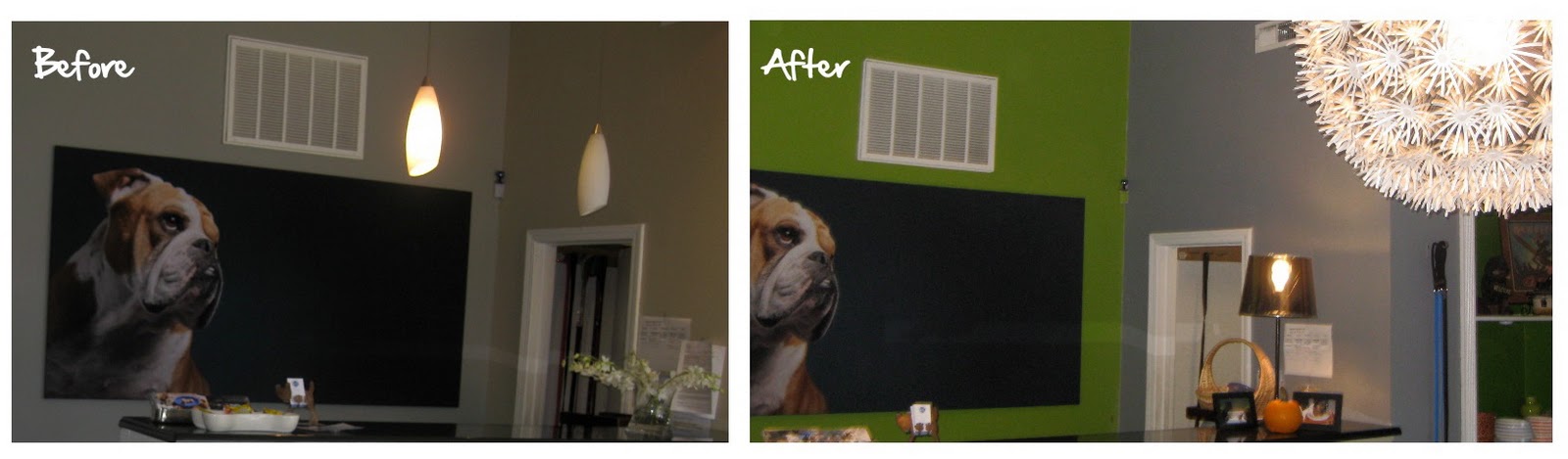
4.  Decor face lift!  Once you make sure that all of your holiday decor is finally down is there something that could really help liven up your space to make it feel new and exciting to patrons?  Changing wall finishes, art or drapery are all low cost ways to get a big bang for your buck.  Also, don’t be afraid to purge... throwing away the plastic vines your aunt put in twenty years ago can really go along way...remember there is a difference between being vintage and being old!
A good interior designer can help guide you through many of the above tips to make sure that you are ready come spring...it doesn’t have to be a huge investment to make sure that your patrons are as energized about your space as they are about your menu! Here I will shamelessly plug for Square One Studios to help you get there!  Email maria@square1studios.com

Tuesday, March 22, 2011

Rainy days and Tuesdays...


Today Chicago continues to welcome in Spring in it's typical quirky fashion... with rain, cold and a vague chance of snow!... How perfect to take a "mental health" day to nurture that pesky "bug" that's going around.... OK, so what if that bug is really your inner book worm?  Two great books for all you foodies out there should keep you cozy on these chilly spring days....

 Gabrielle Hamilton's Blood, Bones & Butter and Grant Achatz's Life, on the Line.

Go to Zagat for book highlights and reviews of these amazing food memoirs!  I am especially interested in our Home Town treasure Grant Achatz's inspiring story battling tongue cancer but Gabrielle Hamilton's poetic prose and bad girl gone good tale are sure to keep you reading!

Thursday, March 17, 2011

It's easy (and chic) being green

In honor of St. Patty's day and memories of Brigadoon.... I got to thinking Green... In an ultra glamorous hollywood kitsch kind of way... how beautiful the Green stuff is, so enjoy my selection from 1st dibs and 
"May the road rise to meet you,
May the wind be always at your back,
May the sun shine warm upon your face,
The rains fall soft upon your fields,
And until we meet again....


Monday, March 14, 2011

CONCEPTS IN EATING

                                                                   LINK VIA Black Book Magazine

A Roy Lichtenstein inspired graphic
overlooks the sleek table scape
What do you get when you cross a 15 year old chef, pop art inspired food, decor and an almost opened New York hotel?....

You get "The Feast" a pop art pop up restaurant serving frozen carrot amuse bouche and girls in hot pink lingerie... Andy Warhol must be chucking in his grave as this temporary restaurant honors it's 15 minutes of fame with food and art inspired by the infamous pop artists.

I love the concept of the "Pop- up" restaurant... with todays rents skyrocketing and dining revenues down this feels like a great option... A much needed injection of cutting edge style, glamour and cuisine.  There long enough to make a statement but not too long for that ever dwindling urban attention span.

Sunday, March 13, 2011

Pug Love: The Eames connection

OKAY, it's sunday... earthquakes, tsunami's, military coup's, and protests abound... and yet I feel the need to indulge myself in this gratuitous display of cuteness... this photo has made it's way around the web and yet still has this self affirmed 'pugaholic' sighing "awww"

Thursday, March 10, 2011

Color Theory: gray + yellow


Around March in Chicago, I get a mean case of the grays.  All around me is gray sky, gray snow, and the pallor of my gray skin as it has not seen sun in months.  So, this got me to my big Ah Ha moment of the season discovering the reason why I am so in love with the gray/yellow color combo... "it's about balance, stupid"...This I mutter to myself because all around me is gray and the one thing that I feel I need desperately is sun...and what color is the sun?..... so you see why I'm calling myself stupid... easy right?, simple... The sun and the clouds balance each other out for one of the most soothing palettes you can imagine, and calm without being dull.  So, in honor of the gray days of march I have assembled some items to make you look forward to sunny days.... or at the very least create a room so that you can have that balance any day of the year!

What is also great about using grays and yellows together is the many different varieties and shades... Grays can go into metallics such as in the Osbourne & Little Carnation Wallpaper, or the blueish tones as in Serena & Lily's Kitchen, or even go greenish gray as in the credenza.  Yellows can be incredibly acidic as in the Adler bedding or closer to green as in the Carnation wallpaper.  Whatever the tone, it's a combination that is quite heavenly...pun intended!

Wednesday, March 9, 2011

What's on your plate?

Ahhh.... Spinach green and Red Series 7 chairs....
like they were made for each other
I am always curious about what people are eating and preparing for themselves.  I grew up in a house where everything was homemade and fresh and was completely envious of friends eating anything pre prepared or processed.  Yes I know, envious of Hamburger Helper, Say it ain't so!....but for me THAT was exotic!  As an adult with many friends who are Chefs, I noticed that they often times are not the same culinary snobs they are in their restaurants... and I have personally witnessed some of the greatest chefs crack open a box of mac n cheese.  So I am not alone in my guilty pleasures, and so this little hobby of culinary curiosity has inspired me to, from time to time, share with you what I am cooking and hopefully you will share with me what you are making...so now about this dish, which is on the healthy side...

There is something about spinach that I can't explain... there are many hater's out there I know, but I am not one of them... for me, one of the most elegant and delicious of comfort foods is the simplicity of this homemade dish.  I have lightly sauteed (warmly wilted) spinach in extra virgin olive oil and garlic. Once finished, I do a quick drizzle of fresh lemon and crown the top with freshly grated parmigiano reggiano.  So simple, yummy and so quick that this dish will go from table to stove in under 15 minutes!

Got ink?


My not so recent obsession with tattooing has led me to acquire a collection of vintage photographs of tattooed sailors, some are dated from the 1920's and others seem to be before then and on up until the 1940's.... i am still perusing through the 100's of images and I thought I would share some of them with you... Even in black and white the ink patterns are beautiful
This form of art has long since been an inspiration to me and other designers (as well as a myriad of Chefs) and I have been impressed by the different techniques used in attaining this type of inked perfection....

Reddish Studios from Israel uses a digital inking method right on to the wood as you can see on the table below what an amazing affect it is. Ted Nemeth who has created the tables and benches below uses many different tooling techniques to the leather to make the tattoo designs pop with such intensity. Then there is the chair from Mama Tried Studio and the leather they use is tattooed as if it is skin, the result is nothing short of beautiful....

Tuesday, March 8, 2011

Before and after: Retail study


What do do when your business needs a fast, inexpensive facelift?
Here are just three things you can do that will instantly change your space and add instant energy...
1. Paint it... go bold, go bright, go graphic but whatever you do make a statement with color and painting is among the least expensive decor changes you can make and often times you can do it yourself.

Case in point.... Citizen Canine, a dog grooming, walking and boarding business that wanted a boutique hotel feel to cater to their upscale cliental while also reinforcing their brand of unique eco friendly/ health conscious products and philosophy...

See the before photo left and after photo right and you can see how a new coat of green really makes the products POP!

2. Let there be light...as you can see by the before photo on the left, the lack lighting in this space creates a dark corner...Not something you want a customer to see as they walk into your shop! 
Simply by adding new track, counter lamps and large dandelion chandelier we changed the room dramatically!  

The chandelier also does twice the work because it acts like signage and draws people in from the outside! All in the lighting was under $500 and found locally in stock.


3. de-clutter... organize the stuff and purge away! This will give your space instant room and a leave customers an impression that you run your business with order and professionalism. When you can, hide desk clutter behind a partition or counter... it's easier to keep clean and offers a place for customers to write checks, set down purses, etc...

Also organizing clutter on shelves, like we've done above can add a dynamic graphic punch while bringing the eye up to expand your interior space!